- DATE:
- AUTHOR:
- The talenthub.io team
- RELATED ROADMAP ITEMS:
- Data visualisation improvements 📊
Release update, December 2022
We can’t wait to show you what our team has been working on for the past months! The team is putting the finishing touches on the updates this week; as soon as they finish up, we will release the below updates.
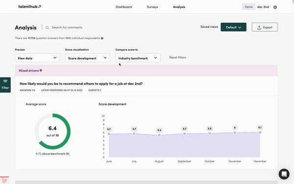
Updated data visualisation
Updates to all charts
Main changes:
Data points no longer appear on a hover effect but will be visible at all times.
Development over time chart on analysis is dynamic and will be adjusted to the selected time-period instead of always showing the past 3 months.
Dashboard CPS/NPS graphs

Survey reply overview chart

Development over time graph on analysis

Benchmark views
We've made some changes to how benchmarks are displayed on question cards. The benchmarks will now be more prominent and will include additional information about how the user's score compares to the benchmark. We've also updated the doughnut-chart's colour to reflect your overall score.
Examples of the new benchmark element

Updated charts for single- and multiple-choice questions
We are introducing benchmarks for verified versions of single- and multiple-choice questions. Your scores are placed on the left side of the bar chart with the number of replies, while the benchmark score can be seen by hovering over the purple charts.
See an example below 
